
Some version on mobile.
Leadership could not judge the future of Dropbox mobile from static screens. The interaction had to run natively.
IMPACT
A research-backed mobile thesis became a native SwiftUI app in roughly two days, giving leadership and engineering something real to judge.
Situation
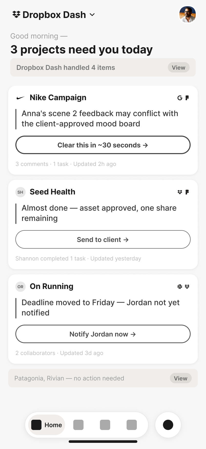
Mobile was the last and vaguest line in an executive brief about the future of AI at Dropbox. I started with research, not screens: foundational customer studies, the One Dash strategy, mobile habits, fragmented project context, and the action-and-approval model behind CoWork.
The synthesis produced a product role. Mobile should not be a compressed web app. It should be the companion where a person catches up, retrieves quickly, approves agent work, and dispatches the next action.
In a March 5 journey review, principal researcher Mahsino sharpened the thesis: explain why an intelligent card appears, treat Calendar as the morning-orientation competitor, keep Library as a familiar safety blanket, emphasize high-value field and retrieval contexts, and surface passive oversight without making managers ask for status.
Making
The direction moved from Pencil wires to high-fidelity HTML using real content and tokens. That fidelity did its job by failing in public: during the March 13 cross-platform review, stakeholders said the polished mobile screens felt like a different product. The custom glass language had drifted from the web story.
I accepted the critique and made two same-evening calls: converge on the same Dropbox design language and content across platforms, and reserve native iOS behavior for what was genuinely platform-specific. I configured the environment, translated the design system into SwiftUI, and began the native pivot that night.
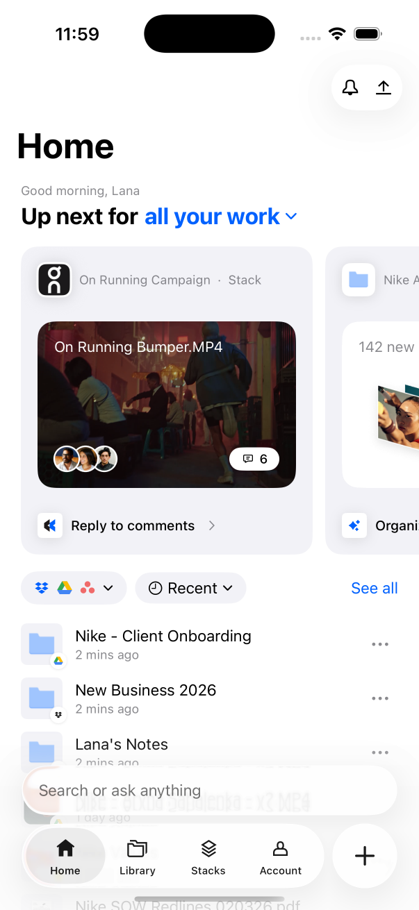
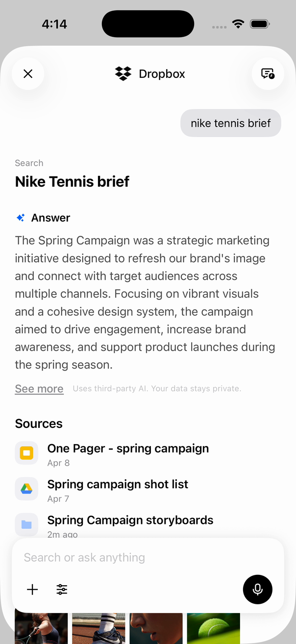
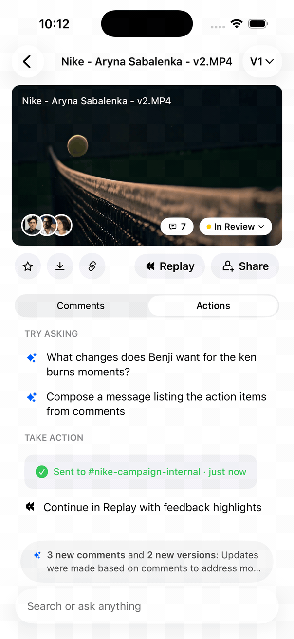
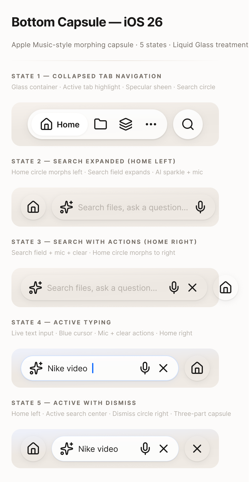
Over roughly two days, I built real SwiftUI navigation and state, one Search and Ask surface, a minimizing bottom capsule, preview with comments and actions, and a CoWork flow that drafted and sent an update. Deterministic demo data kept the review path stable; the navigation, keyboard, sheets, scroll physics, and transitions remained native.
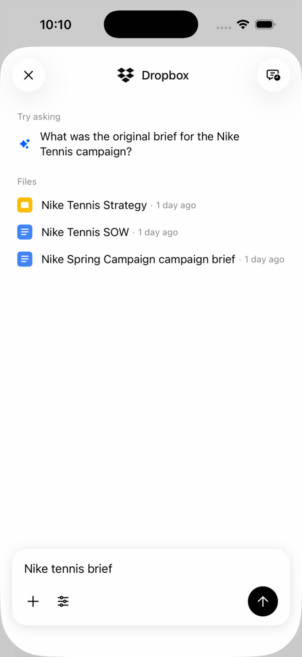
The opening loop shows the answer-and-sources path. This second path tests a materially different question: whether Search can move from broad retrieval into specific typeahead without losing the surrounding context. Every public capture comes from the installed native app; there is no browser port or public runtime.
Outcome
In a two-week executive sprint, I turned an ambiguous mobile brief into a research-backed companion strategy, then built the key paths in native SwiftUI over roughly two days. Leadership could judge the direction in hand; iOS engineers asked for the repository, and the prototype circulated internally.
The iOS engineers asked for the repository, then the mobile experience team joined the review. The prebuilt simulator app circulated internally, and I presented the direction at the Q2 read-in.
The strategic output was larger than a polished prototype. I built the decision system around it: research synthesis, traceable hypotheses, cross-platform critique, native architecture, stakeholder convergence, and an implementation artifact engineering could inspect.
Reflection
Native was the shortest honest route because the remaining unknowns were behavioral. A static screen could describe Search collapsing under a thumb or an action staying attached to a preview. It could not make interruption, reachability, keyboard timing, sheets, and state transitions judgeable in hand.
The SwiftUI app remains local capture provenance only. The evidence on this page is truthful native footage, not a downloadable app, hosted demo, reconstructed web version, or production-service claim.